|
GFF2APLOT HOME PAGE |
Josep F. ABRIL's HOME PAGE |
gff2aplot tutorials. In such cases, the command-line has been simplified. The customization files, if many, have also been summarized into a single one, only the last setting of any variable being redefined from one file to another was kept in sake of clarity. GFF files were merged following the same ordering that was used when passing them via command-line. We hope you will find this examples useful to start using gff2aplot.
 [PNG] [PS] [PDF] |
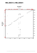
gff2aplot default settings may be enough for what you want to display. When visually exploring pair-wise alignments, this will be the starting point unless you have already defined a customized layout. You can do this by defining a default customization file, by naming it as ".gff2aplot.rc" or by setting a shell variable that points to a file. Imagine you have a customization file named "/your/path/mycustoms" (it is cleaner if you always use a fixed suffix to distinguish among your files, ".rc" for instance). Then, you can force such file to be the default customization file by typing: GFF2APLOT_CUSTOMPATH=/your/path gff2aplot.pl --verbose -- defaults.gff \ > defaults.ps 2> defaults.log |
|
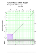
We are running gff2aplot to visualize the alignment produced by SIM on the syntenic MHCII genomic region between human and mouse. The violet left bottom box indicates the region being expanded in the next example ("Zooming into the LMP2 gene region"). The sequences shown here contain four human genes (LMP2, TAP1, LMP7 and TAP2) and their counterpart ones in mouse (lmp2, tap1, lmp7 and tap2). Only the alignment fragments from the SIM output were displayed on the main panel. Scores for those fragments were projected along the human sequence axes in the bottom panel.
gff2aplot.pl --verbose                             \
    --title  "Human/Mouse MHCII Region"            \
    --subtitle "Zooming into the LMP2 gene region" \
    --x-label "Human X87344"                       \
    --y-label "Mouse AF100956+AF027865"            \
    --end-x-sequence 6500                          \
    --end-y-sequence 6500                          \
    --zoom-area                                    \
    --custom-filename figure1_left.rc              \
    -- figure1_left.gff > figure1_left.ps          \
                       2> figure1_left.log
|
 [PNG] [PS] [PDF] |
|
 [PNG] [PS] [PDF] |
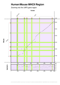
We are focusing on the LMP2 human gene from previous example MHCII genomic region. Gene predictions produced by SGP1 program were included, the predicted exons are shown in red, while the standard GenBank annotated exons color remains green. The main difference between the follwoing command-line and the one from prevoius example is that we replaced the "--zoom-area" switch by the "--zoom" one in order to activate the zoom.
gff2aplot.pl --verbose                              \
    --title  "Human/Mouse MHCII Region"             \
    --subtitle "Zooming into the LMP2 gene region"  \
    --x-label "Human"                               \
    --y-label "Mouse"                               \
    --end-x-sequence 6500                           \
    --end-y-sequence 6500                           \
    --zoom                                          \
    --custom-filename figure1_left_zoom.rc          \
    -- figure1_left_zoom.gff > figure1_left_zoom.ps \
                                2> figure1_left_zoom.log
|
|
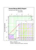
We want to make a figure containing the last two examples. There are several ways of doing that. Here we are showing how to embeed them into a single plot after processing a LaTeX document. That file is also included in the example tarball. ( latex figure1_left_final.tex ; dvips figure1_left_final.dvi -o figure1_left_final.ps ) > figure1_left_final.log 2>&1 |
 [PNG] [PS] [PDF] |
|
 [PNG] [PS] [PDF] |
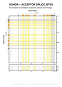
You can set different alignment colors with gff2aplot in order to visualize different alignment features. For this example, we are comparing all the possible splice sites found in an human/mouse orthologous gene genomic sequences. We have set color for donor sites ("GT", 3698 hits) to red and color for acceptor sites ("AG", 3639 hits) to blue. Color intensity for both features depends on the score we assigned to those splice sites (more likely to be real, darker the color). Another interesting feature already implemented in gff2aplot is the pseudo color blend that enhances the axes annotation projections.
gff2aplot.pl --verbose                                           \
    --title  "DONOR + ACCEPTOR SPLICE SITES"                     \
    --subtitle                                                   \
      "An example of annotation projections pseudo color-merge." \
    --x-sequence-coords 0..4200                                  \
    --y-sequence-coords 0..4600                                  \
    --custom-filename figure1_right.rc                           \
    -- figure1_right.gff > figure1_right.ps                      \
                        2> figure1_right.log
|
|
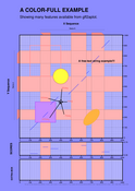
An invented data set is used here to illustrate different drawing features of gff2aplot. Look carefully to the customization file to understand how you can include "extra" features (such boxes, circles, arrows and text) into your plots. This allows you to highlight any region on your alignment panel.
gff2aplot.pl --verbose                                  \
    --custom-filename fancylayers.rc                    \
    --title 'A COLOR-FULL EXAMPLE'                      \
    --subtitle                                          \
      'Showing many features available from gff2aplot.' \
    --x-sequence-zoom  100..400                         \
    --y-sequence-zoom  600..900                         \
    --zoom-area                                         \
    -- fancylayers.gff > fancylayers.ps                 \
                      2> fancylayers.log
|
 [PNG] [PS] [PDF] |
|
|
|
GFF2APLOT HOME PAGE |
Josep F. ABRIL's HOME PAGE |
| jabril@imim.es |